
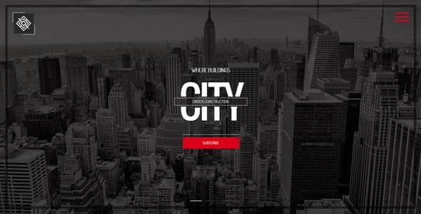
City || Responsive Coming Soon Page – Bootstrap HTML5 Template
Original price was: $59.00.$11.80Current price is: $11.80.
Setting up a temporary landing page before an official site launch usually demands a balance between visual impact and quick deployment. City is a responsive HTML5 coming soon template built on the Bootstrap framework, designed specifically for creative agencies, photographers, and independent designers preparing for a full web release. It provides a structured layout for displaying progress counters, contact details, and portfolio previews without requiring complex backend setups.
Best suited for freelancers, studios, and web developers who need an immediate, lightweight under-construction presence, this front-end package includes 48 HTML style variations, full-screen media capabilities, and custom background effects. It is not intended for users seeking a full content management system or dynamic blogging backend out of the box, as it operates entirely as a static HTML/CSS template with client-side script validation.
| Specification | Details |
|---|---|
| Template Type | HTML5 / CSS3 Responsive Coming Soon Page |
| Core Framework | Bootstrap v3.x Compatible |
| File Count | 48 HTML Files (48 Style Variations) |
| Background Options | Slideshow (Ken Burns), Single Image, YouTube Video, Self-Hosted HTML5 Video |
| Visual Effects | 5 Animated Background Effects (Grain, Rain, Snow, Particles, Clouds) |
| Icon Integration | Font Awesome v4.4.0 (Complete 585 Icon Set) |
| Forms Included | AJAX Contact Form & MailChimp Newsletter Signup (With Validation) |
| Code Standard | W3C Validated HTML5, Clean Commented CSS |
Key Features and Technical Capabilities
Diverse Background Media & Background Effects
City provides extensive visual background configurations split across 48 dedicated HTML template files. Developers can choose between full-screen single images, Ken Burns pan-and-zoom slideshows, background YouTube video embeds, or self-hosted HTML5 video players (12 styles available for each format). Additionally, 5 specialized animated canvas overlays—film grain, rain, snow, interactive particles, and moving clouds—allow customized themes across light and dark skin variations.
Integrated Content Sections
The template contains 7 structured content areas organized within a single-page layout:
- Home View: Features 3 distinct main page layouts with designated space for custom company logos.
- About Page: Dedicated text and visual blocks for introducing studio backgrounds or project details.
- Services Page: Integrates an OWL Carousel slider for displaying core service offerings or skills.
- Works Page: A touch-friendly, responsive image gallery engineered for portfolio showcases.
- Contact Page: Includes styled form components and interactive location or contact details.
Interactive Components & Form Integrations
- jQuery Countdown Timer: Displays live countdowns to launch dates with straightforward script configuration.
- Text Rotator & Content Changer: Offers dynamic cycling headlines with smooth transition effects.
- AJAX MailChimp Signup: Collects email subscriptions directly to MailChimp lists without requiring a browser page refresh.
- AJAX Contact Form: Features built-in JavaScript validation to process client inquiries efficiently.
- Typography & Icons: Utilizes Google Fonts typography styling alongside the full set of 585 Font Awesome v4.4.0 vector icons.
Frequently Asked Questions
Can the countdown timer and subscription forms be configured without backend programming?
Yes. The jQuery countdown timer is adjusted by changing a target date string in the JavaScript configuration file. The MailChimp form and contact form handle validation via client-side scripts, making them simple to connect to standard web hosting environments.
Are the original demo photos included in the download archive?
No, demo images are not included in the main download. Structural image placeholders are provided throughout the HTML files so you can insert your own media assets.
Is the layout compatible across desktop and mobile screens?
Yes, built on the Bootstrap grid system, the template automatically adjusts to smartphones, tablets, and desktop displays while preserving touch-friendly gallery controls and responsive navigation menus.
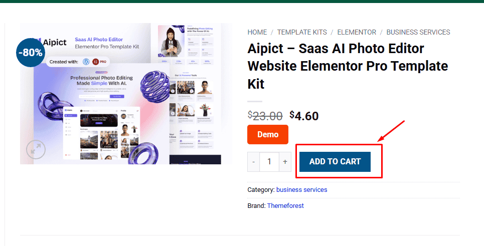
1. Click Add to cart
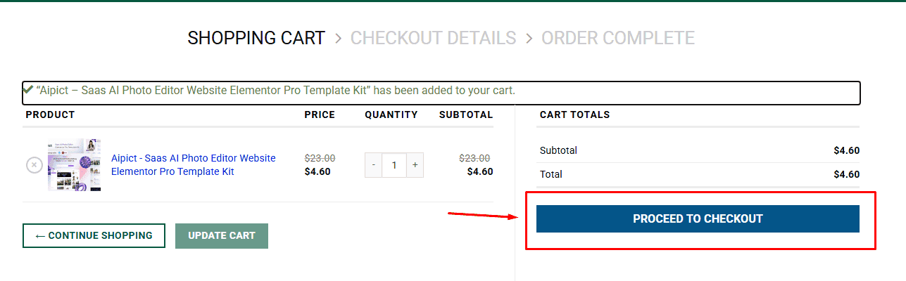
2. Review your items and click Proceed to checkout
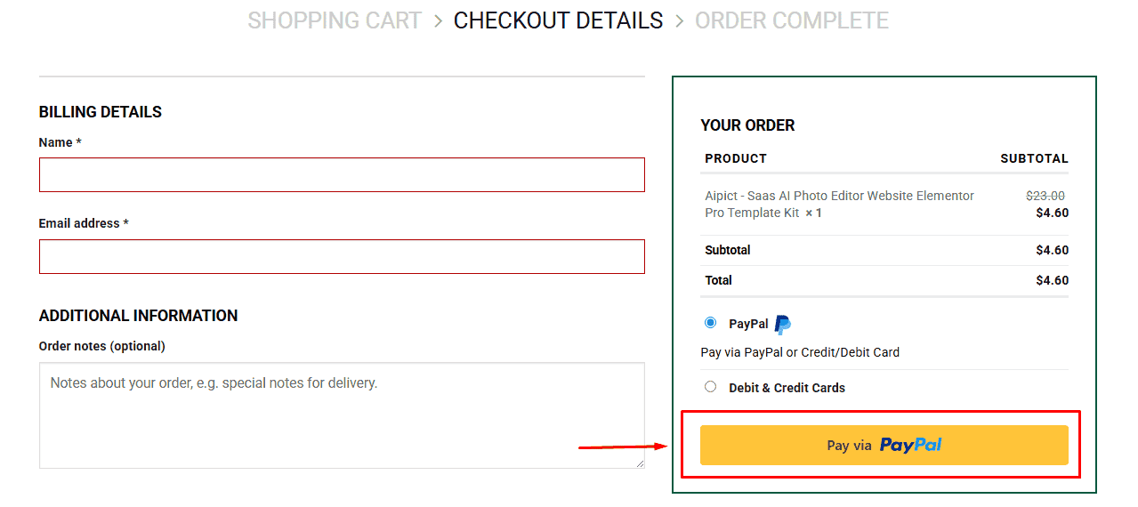
3. Fill in your billing details: Name, Email, and Password
4. Choose your preferred payment method
5. Click Pay via Paypal to proceed
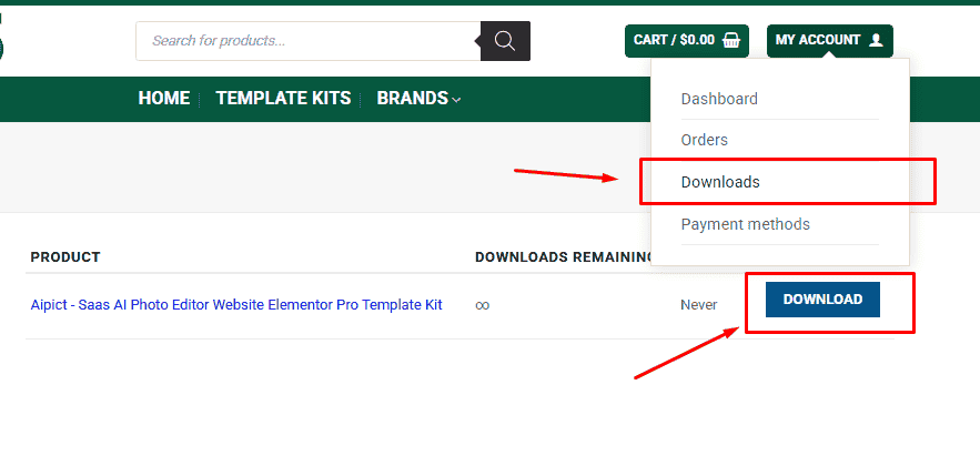
6. Access Downloads to get your files
Related products


