

schön. | eCommerce HTML Template – Minimal Bootstrap UI
Original price was: $20.00.$4.00Current price is: $4.00.
Finding a lightweight, non-bloated storefront interface often means manually stripping down complex, bulky frameworks. Schön provides a clean HTML5 and CSS3 foundation engineered specifically for high-speed online shops without unnecessary code bloat.
Schön is a minimalist e-commerce HTML template built with Bootstrap, HTML5, and CSS3 standards. Designed for front-end developers, agencies, and shop owners, it serves as an efficient frontend baseline that can easily be integrated into any CMS platform. It is best suited for custom web builds requiring high performance and clean markup; however, it is not suited for non-technical users seeking a plug-and-play WordPress plugin or ready-made backend system without coding knowledge.
| Technical Specification | Details |
|---|---|
| Core Tech Stack | Bootstrap, HTML5, CSS3 |
| Homepage Options | 9 Pre-built Layouts |
| Typography | Source Sans Pro (Body), Montserrat (Titles) |
| Icon Libraries | Font Awesome, Simple Line Icons |
| Layout Responsiveness | 100% Mobile & Desktop Responsive |
| Documentation | Detailed Help File Included |
| Support Window | Monday – Friday (UTC+7), 24-48 Hours Response |
Key Design & Layout Features
- 9 Homepage Variations: Flexible homepage structures designed to accommodate diverse online store niches.
- Megamenu Navigation: Easy-to-customize mega menu support paired with static block structures.
- Interactive UI Components: Built-in Quick View modals, popup newsletter forms, and animated banners.
- Multi-Purpose Product Sliders: Configured carousels for Featured, Sale, New Arrivals, Bestsellers, Upsell, and Related products.
- Content & Media Layouts: Includes styled blog templates and brand logo sliders for partner display.
Note: Preview images shown in demo displays originate from Unsplash, Shutterstock, and Google Images and are not included in the main download package.
Frequently Asked Questions
Can this template be converted into dynamic e-commerce platforms?
Yes. Schön is constructed using structured HTML5 and standard Bootstrap code, making it simple for back-end developers to convert the static markup into custom templates for WordPress, WooCommerce, Shopify, or Magento.
Is the layout fully responsive across mobile devices?
Yes, the template utilizes Bootstrap’s flexible grid layout to ensure product grids, navigation menus, and media sliders scale cleanly across smartphones, tablets, and desktop displays.
Are the demo images included in the main source files?
No, all stock photos used in the preview demo are for demonstration purposes only. The final download bundle includes all HTML files, CSS stylesheets, JavaScript assets, and technical documentation.
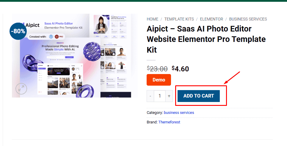
1. Click Add to cart
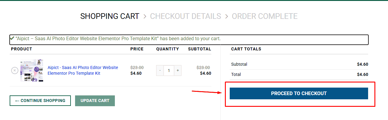
2. Review your items and click Proceed to checkout
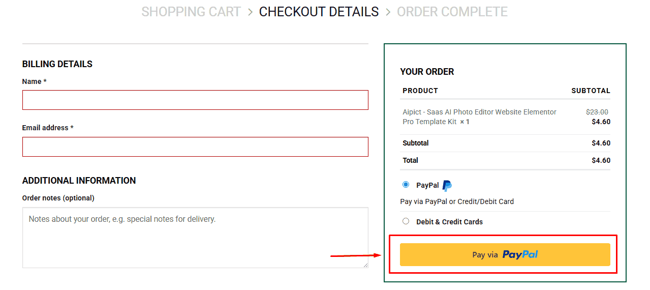
3. Fill in your billing details: Name, Email, and Password
4. Choose your preferred payment method
5. Click Pay via Paypal to proceed
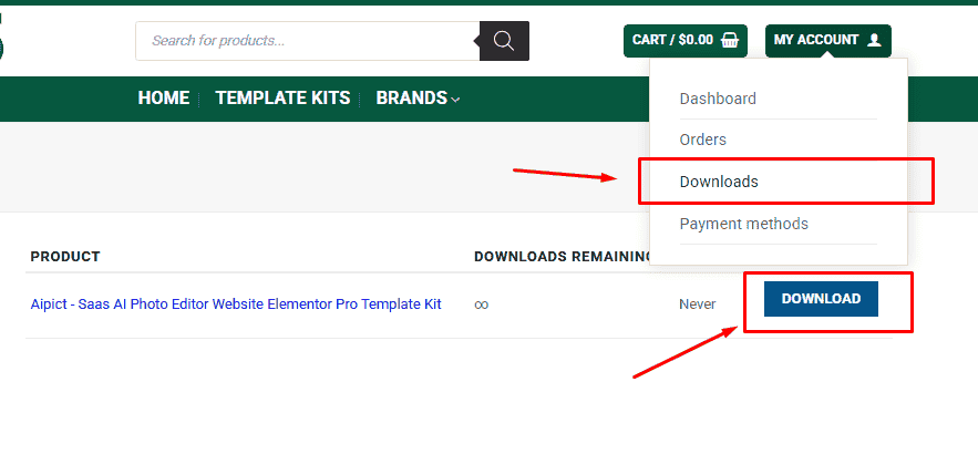
6. Access Downloads to get your files
Related products


