

PIXEL : Multipurposes Creative Template – Responsive HTML5 Template
Original price was: $35.00.$7.00Current price is: $7.00.
Building a clean agency website or dynamic portfolio requires lightweight markup and flexible grid structures without bulk. PIXEL is a multipurpose HTML5 and CSS3 website template engineered for creative agencies, corporate enterprises, and independent freelancers needing a structured front-end foundation. It provides a responsive, retina-ready layout featuring both one-page and multi-page configurations alongside parallax scrolling, shop templates, and integrated social feeds. This static site template is best suited for web developers and designers building custom front-ends; it is not a direct plug-and-play WordPress theme for non-technical users.
| Specification | Details |
|---|---|
| Code Base | HTML5, CSS3 |
| Layout Types | Responsive Grid, One-Page & Multi-Page Configurations |
| Display Support | Retina Ready (High-DPI Optimized) |
| Included Pages | Shop, Single Project, Blog Archive, Blog Details |
| Interactive Features | Parallax Scrolling, Twitter Feed, Instagram Feed |
Core Architecture and Features
- Dual Layout Structures: Offers full support for both single-page landers and multi-page agency site structures.
- E-Commerce UI Elements: Built-in shop section layouts structured for product listings and promotional displays.
- Social Feed Components: Embedded widgets designed to sync and display live Twitter and Instagram streams.
- Parallax Background Support: CSS3-driven background visual effects that enhance user interaction during page scrolling.
- Structured Portfolio Pages: Dedicated single-project templates tailored for case studies and visual presentations.
- Clean HTML5 & CSS3 Standards: Well-commented, lightweight front-end code for faster rendering and easier customization.
Frequently Asked Questions
Is the PIXEL template a ready-to-use WordPress theme?
No, PIXEL is a static HTML5 and CSS3 site template. Using it inside WordPress or another CMS platform requires converting the static HTML code and style assets into a native theme structure.
Are the images from the live preview included in the download package?
The preview images are third-party assets used strictly for demonstration. They are not bundled inside the main source file, but free download references are provided within the project assets.
How does the template handle mobile devices and high-resolution displays?
The code uses a fully responsive grid system that scales smoothly across desktop browsers, tablets, and smartphones. The design is retina-ready to ensure sharp display rendering on high-DPI screens.
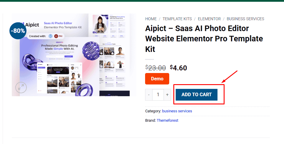
1. Click Add to cart
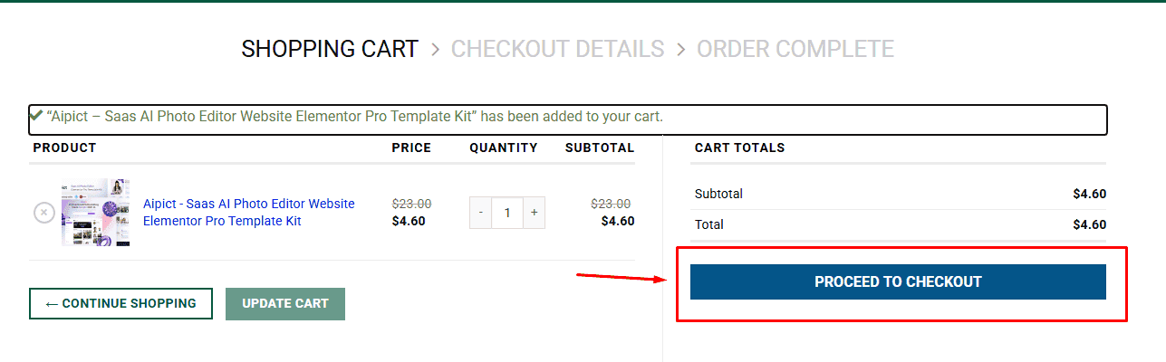
2. Review your items and click Proceed to checkout
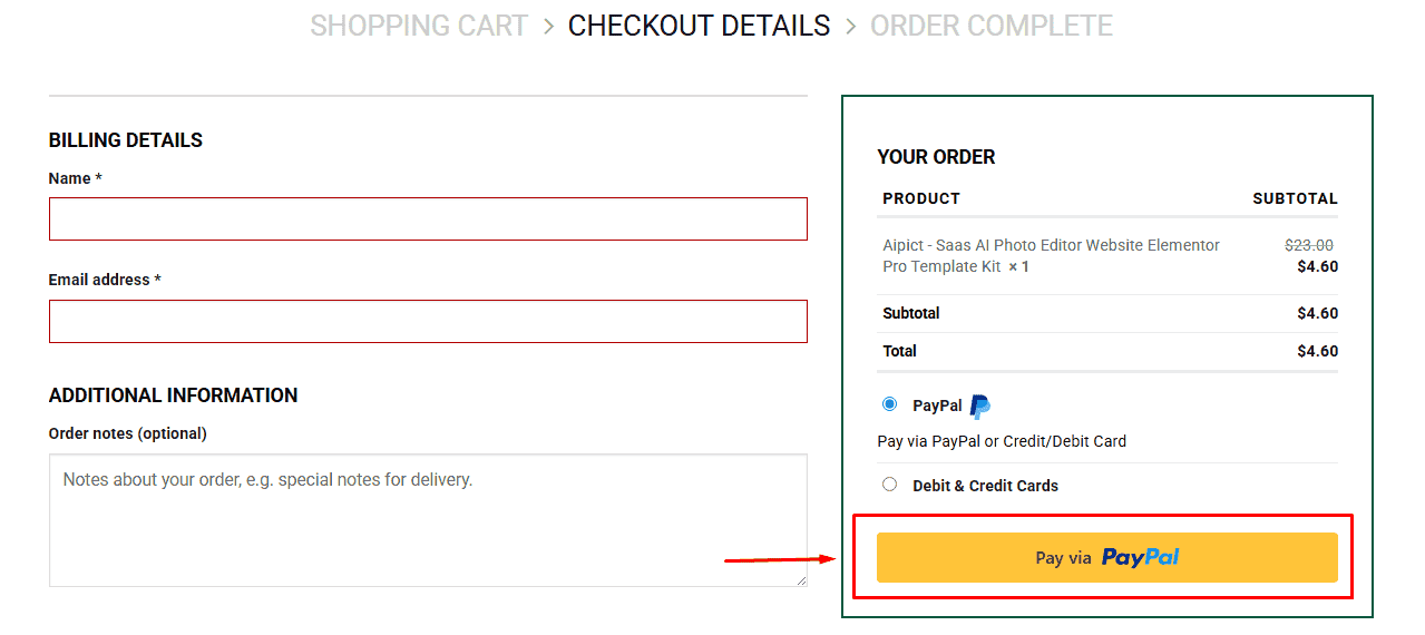
3. Fill in your billing details: Name, Email, and Password
4. Choose your preferred payment method
5. Click Pay via Paypal to proceed
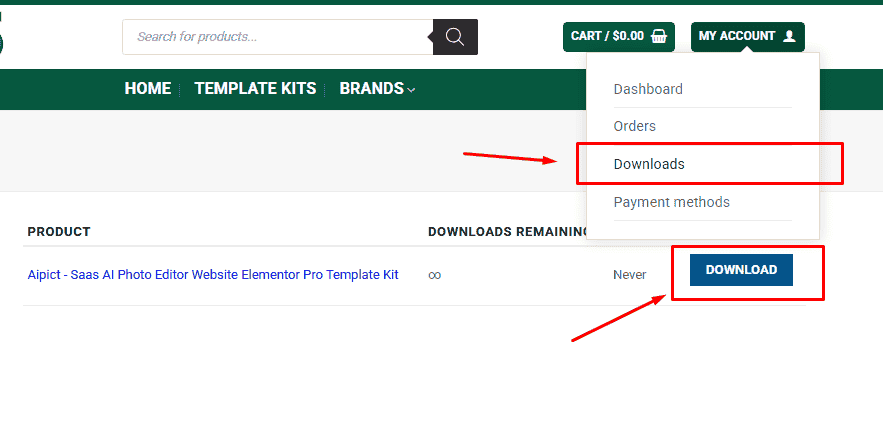
6. Access Downloads to get your files
Related products


