

Greenshift – All in One – Speed-Optimized Page Builder
Original price was: $57.00.$11.40Current price is: $11.40.
Struggling to achieve perfect Core Web Vitals scores while building highly animated, modern layouts on WordPress? Traditional page builders often bloat your site with heavy frameworks, unused scripts, and redundant CSS, driving down mobile performance and search engine rankings. Greenshift addresses this issue directly by generating all assets on the fly, loading styles and scripts only when they are actively used on a page.
Performance-First Architecture for Modern WordPress
Unlike conventional web design tools, this plugin functions without predefined styles, rigid frameworks, icon fonts, or bulky script libraries. Every style chunk is loaded inline in the head section of the page, which prevents Cumulative Layout Shift (CLS) and eliminates compatibility issues with caching plugins. All dynamic libraries are built without jQuery dependencies, ensuring your site remains lightweight and fast.
Key Technical Features and Engine Capabilities
- Ready Section Library: Access a pre-built library of layouts and sections fully compatible with Full Site Editing (FSE).
- Interaction Layers: Add dynamic interactivity to blocks using custom triggers, conditions, and actions.
- Advanced CSS Grid & Containers: Control every alignment, spacing, and flexbox option with responsive support for up to 4 breakpoints.
- Editor Design Helpers: Modify positions, margins, padding, borders, and sizes directly within the editor interface.
- Smart Mobile Scrolling: Turn standard multi-column layouts into horizontal scrollable items or carousels on mobile screens for an app-like experience.
- Advanced Sliders & Tabs: Convert standard galleries and content blocks into 3D sliders, tabs, or custom carousels.
- AR/VR and 3D Support: Integrate interactive 3D assets directly using the AR/VR 3D viewer and Spline3D blocks.
- Dynamic Data Integration: Retrieve and display custom fields, user meta, site options, and external feeds with a built-in meta getter.
Advanced Responsive Controls and Smart Layouts
With mobile traffic outperforming desktop visits, responsive design is a core priority. This toolkit provides four custom breakpoints with live preview modes, allowing you to assign unique values for different screen resolutions. To preserve server resources and page speed, you can convert complex layouts into shortcodes or configure blocks to load dynamically only when they enter the viewport or when triggered by click or hover events.
Extend Functionality with Specialized Addons
The core features are designed to remain fully functional without limitations. However, specialized workflows can be expanded with dedicated modules:
Animation Addon
While the core version supports custom CSS animations, this addon integrates advanced features powered by the GSAP library. Implement scroll-bound animations, pinning, smooth state transitions, smart Lottie loaders, text reveals, SVG animations, and video loaders. It also includes a specialized Rive block and API to connect dynamic site data directly to Rive interactive scenes.
Query Addon
Designed for dynamic directory sites and complex content structures. This module includes pre-built query loop patterns, custom meta getters for ACF or Toolset, wishlist systems, rating counters, and visibility filters. You can show or hide content based on user roles, taxonomies, or custom field values, making it easy to construct advanced listing architectures.
SEO and Marketing Addon
Built on a 10-year history of developing tools for affiliate, review, and comparison websites. This addon provides conversion-focused elements such as dynamic comparison tables, comparison listings, review cards, score boxes, and offer grids. All elements feature mobile-optimized layouts designed to increase affiliate click-through rates.
WooCommerce Addon
Integrate WooCommerce elements directly into your Full Site Editing (FSE) workflow. Access tools like custom Buy now buttons, free shipping thresholds, sold out indicators, product bundles, sliding side panels, and AJAX-powered product search to improve the shopping experience.
Check out Greenshift block gallery and explore the unique features page to see these layout options in action.
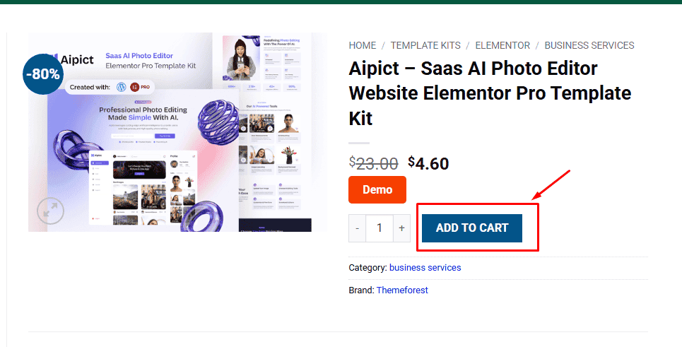
1. Click Add to cart
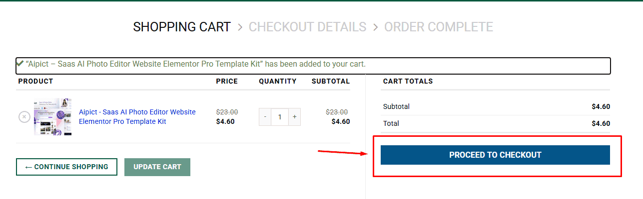
2. Review your items and click Proceed to checkout
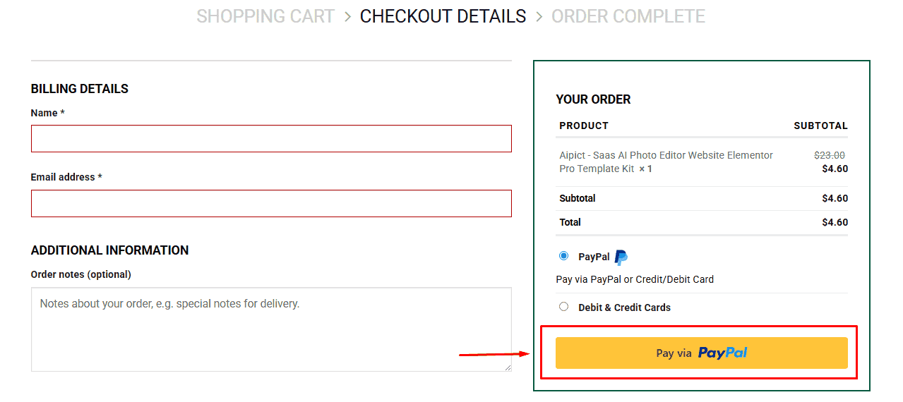
3. Fill in your billing details: Name, Email, and Password
4. Choose your preferred payment method
5. Click Pay via Paypal to proceed
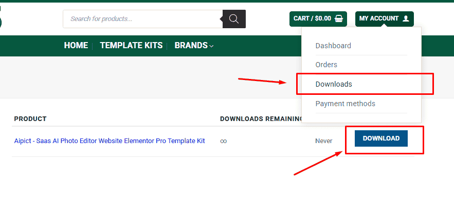
6. Access Downloads to get your files
Related products


