

Gowashly-Laundry Service Mobile App Figma Ui Kit – 55+ Screens
Original price was: $16.00.$3.20Current price is: $3.20.
Design UI assets for on-demand laundry and dry cleaning platforms often require detailed user flows ranging from scheduled pickups to real-time order tracking. Gowashly addresses these operational needs with a dedicated mobile application design system built natively in Figma.
Gowashly is a mobile application UI template engineered for product designers, software agencies, and entrepreneurs building laundry service platforms. Built with Figma’s native component architecture, this kit solves complex layout decisions by offering 55+ ready-to-use mobile screens covering service discovery, cart management, and order status updates. This digital asset is best suited for UI/UX prototyping and client handoffs; it is not a coded application and requires software developers to build the frontend and backend functionality.
| Specification | Details |
|---|---|
| Product Format | Figma UI Kit (.FIG) |
| Total Mobile Screens | 55+ Unique Screen Layouts |
| Primary Target Industry | On-Demand Laundry, Dry Cleaning & Home Services |
| Typography Used | Inter (Free Google Font) |
| Design System Features | Global Styles, Reusable Components, Layer Groups |
| Image Rights | Demo Images Not Included (Placeholders Used) |
| Documentation | Instructions Included |
Core Interface Flows & Layout Coverage
Gowashly covers all fundamental interactions necessary to prototype an on-demand service app. The design system features vector-based layouts aligned to mobile grids, allowing for fast customization and export.
Essential Mobile User Flows
- Onboarding & Authentication: Splash screens, multi-step onboarding, location selection with map views, account creation, and password retrieval flows.
- Service Browsing & Selection: Categorized home views, search result filtering, item detail layouts, and pricing breakdowns.
- Cart & Checkout System: Item management, delivery address selection, payment method configuration, and PIN verification screens.
- Order Tracking & Status Updates: Multi-stage real-time tracking screens, delivery completion views, and user feedback/rating prompts.
- In-App Communication & Profile Settings: Embedded chat interface, audio/video call screens, profile editing, and notification controls.
Figma Component Organization & Design System
Every file within the Gowashly package follows a structured layer hierarchy with clear naming conventions. Utilizing Figma’s global color styles and typography tokens, design teams can quickly rebrand the entire application interface to match specific client guidelines.
- 100% Vector Layouts: Scalable UI elements structured for various mobile screen resolutions.
- Pixel-Perfect Alignment: Built on consistent spacing tokens for developer handoff efficiency.
- Organized Component Libraries: Easily swap icons, button states, and form inputs across all 55+ screens.
Frequently Asked Questions
Does this package include working source code or mobile scripts?
No, Gowashly is strictly a design UI kit containing Figma (.FIG) template files. It does not contain HTML, Flutter, React Native, or backend code. Software developers will need to convert these visual designs into actual application code.
How do global styles work within this Figma UI kit?
The kit uses Figma’s native style system for colors, typography (Inter font), and recurring UI components. Updating a master component or color token automatically reflects across all 55+ connected screens.
Are the demo images included in the file download?
No, preview images sourced from stock platforms are excluded due to licensing restrictions. Image containers are left as clean vector placeholders so you can insert your own photography easily.
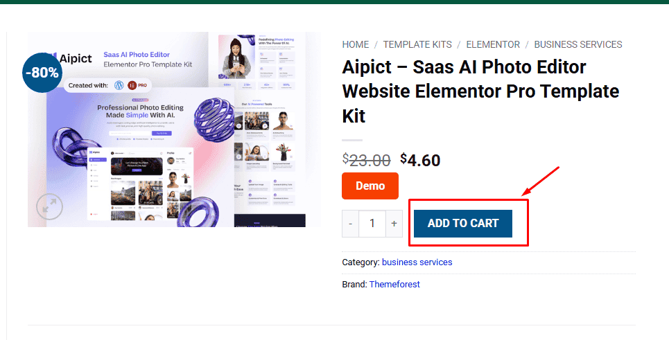
1. Click Add to cart
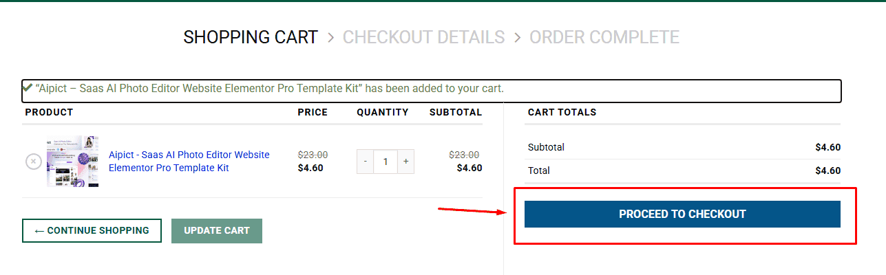
2. Review your items and click Proceed to checkout
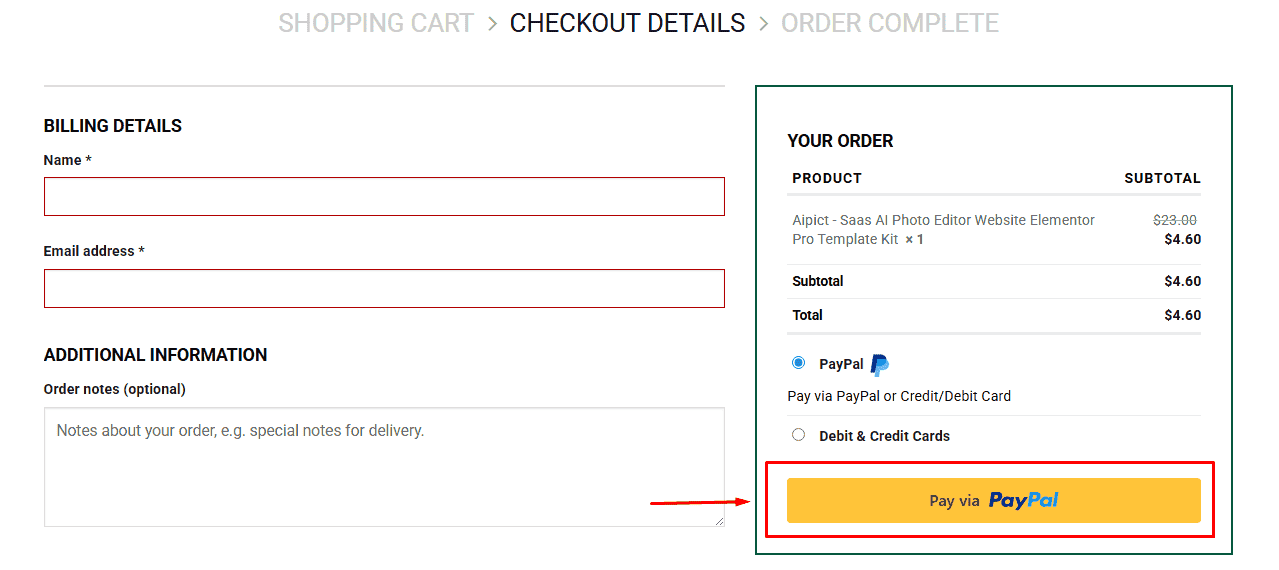
3. Fill in your billing details: Name, Email, and Password
4. Choose your preferred payment method
5. Click Pay via Paypal to proceed
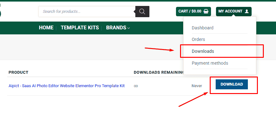
6. Access Downloads to get your files
Related products


