
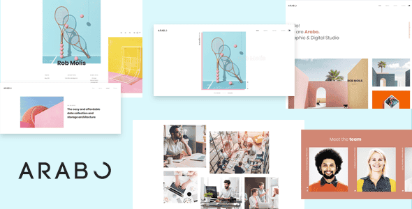
Arabo – Creative Portfolio Template – Clean HTML Portfolio
Original price was: $17.00.$3.40Current price is: $3.40.
Arabo provides a lightweight, modular structure engineered specifically for agency showcases and creative professional sites. Built with well-structured HTML and CSS, this template simplifies presenting high-resolution visual portfolios across varying screen resolutions without bulk or rendering bottlenecks.
Arabo is a modern, responsive HTML portfolio template tailored for design agencies, architects, freelancers, and photography studios needing a clean online presence. It streamlines portfolio presentation through fluid layouts and standardized markup. This template is ideal for developers and creatives seeking an easily adaptable front-end foundation, though it is not suited for non-technical users looking for a drag-and-drop CMS backend out of the box.
| Specification | Details |
|---|---|
| Product Type | HTML5 / CSS Web Template |
| Design Layout | Fully Responsive & Grid-Aligned |
| Target Audience | Agencies, Architects, Photographers, Freelancers |
| Code Architecture | Clean, Standardized Front-End Code |
| Device Compatibility | Cross-Browser & Handheld Device Tested |
Core Features & Layout Capabilities
- Fluid Responsive Grid: Adapts automatically across desktop displays, tablets, and mobile screens without broken UI components.
- Clean Markup Structure: Hand-coded, well-commented HTML and CSS files that make custom integrations and maintenance straightforward.
- Multi-Discipline Flexibility: Pre-designed layouts adaptable for architectural agencies, personal portfolios, photo studios, and freelance services.
- Fast Rendering Performance: Uncluttered code foundation helps reduce DOM complexity and maintains fast loading speeds.
Frequently Asked Questions
Is Arabo a WordPress theme or a static template?
Arabo is a static front-end HTML template consisting of structured HTML, CSS, and JavaScript files. It is not a native WordPress theme, though developers can readily adapt its code into custom CMS themes.
How difficult is it to customize the template styles?
The template relies on well-organized stylesheets and semantic HTML tags. Developers with basic knowledge of HTML/CSS can quickly re-theme components, adjust typography, or alter color schemes.
Does the template render properly on mobile devices?
Yes, the template has been tested across major desktop and handheld browsers. The flexible layout scales fluidly across various viewport sizes to maintain readable text and aligned media assets.
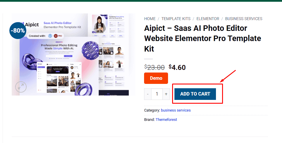
1. Click Add to cart
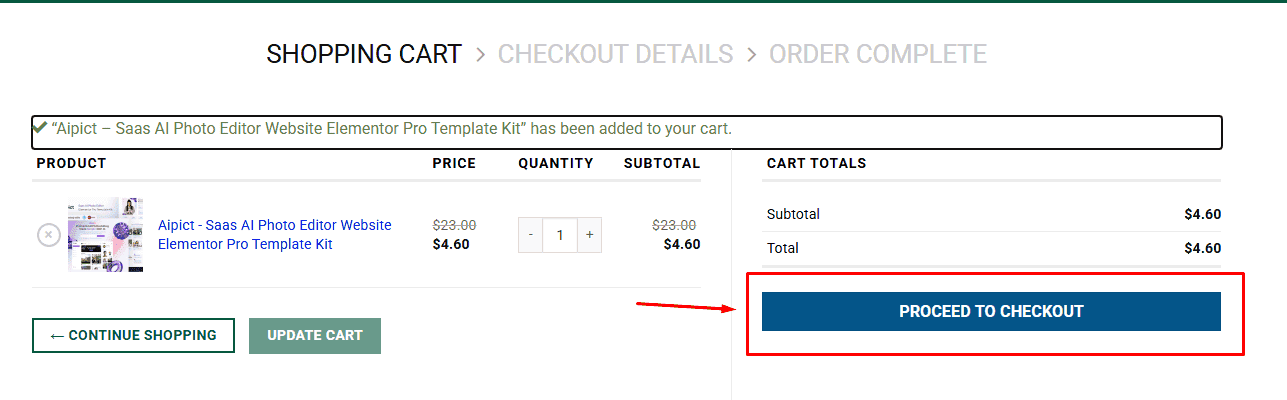
2. Review your items and click Proceed to checkout
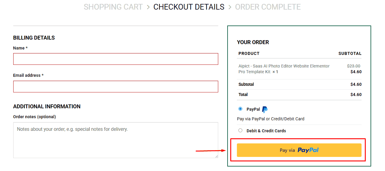
3. Fill in your billing details: Name, Email, and Password
4. Choose your preferred payment method
5. Click Pay via Paypal to proceed
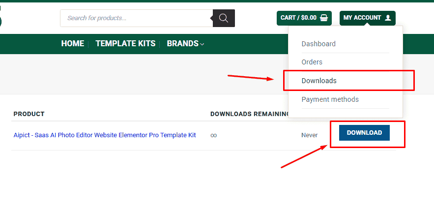
6. Access Downloads to get your files
Related products


